I thought I wanted something 'iPhone-sized,' but I was wrong
Late on the night of September 9th, 2012, I was sitting at my kitchen table, going over notes for a piece I was writing about video game arcades.
The next morning at 6AM I was bound for an Amtrak train which would
take me to Pennsylvania, then to Baltimore, on a four-day trip of
interviews for the piece. I was packed and ready for bed. I was
exhausted, and as I brushed my teeth, thought of the next day’s work.
I’d like to be able to say that
I went peacefully to bed, my iPhone tucked underneath my pillow as I
was wont to do, but that isn’t what happened. What happened, instead,
was a series of events involving my phone, a toilet, and a bowl of rice
at 1AM. As I removed the SIM card from the phone and buried it in rice,
still vibrating and refusing to power down, I didn’t know that my phone
was definitely, totally, completely dead.
I went to bed angry at myself for dropping my phone into a toilet
In horror, I quickly and
hastily chose from among the dozens of tester phones I am routinely
surrounded by. I passed up a Windows Phone as too foreign since I have
so little experience with them, and settled on a European version of the
HTC One S. It
was bigger than my iPhone, which I didn’t like, but it was close enough
in size that I thought I could manage for the unavoidable four days of
hell I was surely in for. After all, traveling with a brand-new phone
when I’d need access to my emails, maps, music, and text messages with
only minutes to make the switch was not ideal in any way. I went to bed
afraid and confused, angry at myself for dropping my phone into a
toilet. As I struggled to figure out how to set the alarm on this
dreaded device and silence its notifications, I cursed it openly.
This was my introduction to Android.
I was suspicious of sizing up: I
assumed that my days of multitasking one-handed were over, and they
were. The One S wasn’t mine and it wasn’t an American phone, which
seemed to cause it occasional data problems, but, other than that, I
loved it. I got on that Amtrak train on September 10th groggy and
acutely aware that I was going to be uncomfortable with my phone for the
duration of the trip.
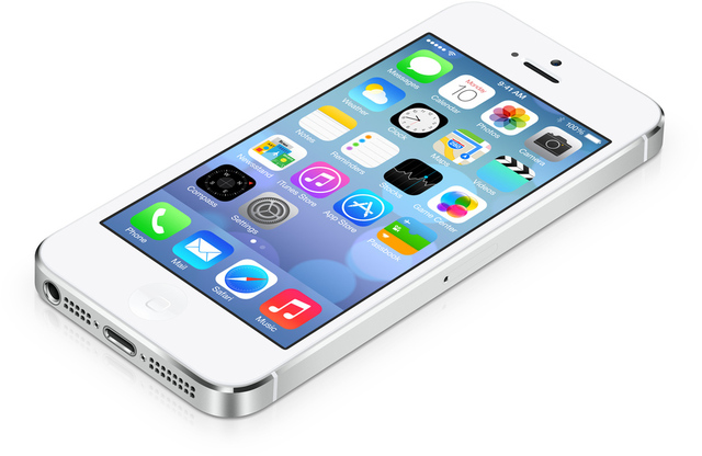
It’s now been so long since I touched an iPhone
But I was wrong. By the end of the trip I was emailing other Verge
writers, effusively praising the glories of Android. Rdio worked
beautifully! The notifications were so much better than the iPhone’s! My
email, oh God, my email. I composed long, beautiful emails in dead
spots where I had no service and it quietly sent them later on. The
Twitter app seemed... better. It loaded faster, I thought. The battery
life was better than my iPhone’s. I could effortlessly Gchat, 24 hours a
day! Editing documents on my phone was something I could actually do
realistically now. Oh, and the maps put the iPhone 4 to shame. There
were other, smaller things, too, but I can’t remember them, because it’s
now been so long since I touched an iPhone.
The most important thing was
that the transition, which I’d sort of wanted but feared for several
years, was seamless, mostly because I already used so much Google stuff.
This should come as no surprise to switchers and long-time Android
users, but it did to me. I’d messed around with Android phones over the
years, but had lazily stuck with iPhones, consistently, since their
debut back in 2007. There were plenty of things I didn’t like about the
iPhone, but I’d never encountered anything I considered a deal breaker.
Nothing but absolute force made me change. And when I did change, I
never looked back.
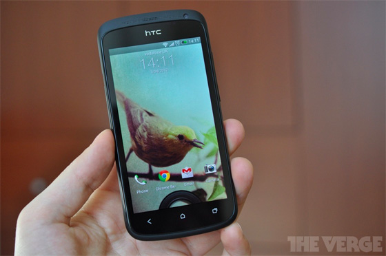
The HTC One S
I didn’t even try to turn my
iPhone back on when I got home four days later. In fact, I didn’t try to
turn it on for about six months (it’s dead, as I suspected). And, while
I’ve been actively window shopping for a phone to call my own since
last September, I never once seriously considered buying a new iPhone.
A few months ago I started
saying that while I loved Android, my ideal Android phone didn’t exist
for AT&T. Let me describe it: It’s an Android phone, made by HTC,
and it’s about the size of an iPhone. It has LTE. The size was really
the one remaining annoyance, I guess. Though I’d adjusted just fine to
the extra height and width of the One S four months ago or so, I still
had it in my head that the ideal phone for my smallish hands was
roughly... iPhone sized.
Enter the Facebook phone, also known as the HTC First.
No phone could fit my wish list more perfectly, and once I realized
that the Facebook veneer was optional, I assumed this would be my next
phone. Finally, I thought, someone woke up and made what I’ve been
dreaming of! And it's HTC! HTC whose Beats by Dre (don’t laugh, they
rule) I adore and now require, whose hardware is, in my opinion, the
best in the industry, whose Sense skin I actually really like. Thank
you, HTC!
Finally, I thought, someone woke up and made what I’ve been dreaming of
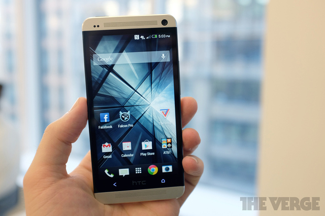
But I didn’t buy it. Instead, I
decided to give the also-brand-new HTC One a spin. The One is HTC’s
newest, beautifully designed and built flagship Android phone. Sure, it
has some weird home screen stuff on it which made me mad to look at, but
it was easily disabled, leaving me with Sense, which as I said, I’m a
fan of. The One was also quite large by my standards and I assumed that I
wouldn’t want to buy one because of that.
Again I was wrong. Now, it’s
not like this phone is giant, but it feels different, and it takes some
getting used to. The first few days were uncomfortable, and I thought
about going back to the One S until I found a phone I wanted to commit
to. I briefly thought, "I should just get that Facebook phone," as my
thumb struggled mightily to reach the notification drop down one-handed.
By the end of the first week, though, I had adjusted. There were some
things that I knew I wasn’t willing to budge on that would make it hard
for me to abandon the One: First, the screen, which is large, is also
incredibly beautiful; it’s beautifully built, and it seems to be
indestructible, though I haven’t tried dropping it in a toilet... yet.
My hands needed to learn to stretch
The truth is that while I
spent months imagining — and talking about — a phone which was exactly
the HTC First, I was all the while adjusting to a different and better
reality: that of a slightly larger phone. The smaller "iPhone-sized"
dream was just a red herring.
It’s been almost eight months,
and one month ago, I finally relinquished that HTC One S, trading it in
for the much larger, but very similar, HTC One.
Here’s the thing: I’m probably
a pretty standard smartphone user, in that I find something I like and I
stick with it. I don’t switch phones every few months or even every
year. Change isn’t hard, it’s just not something I’m interested in. I go
with what works, and I think that’s what most people should do. I’ve
had five phones in around seven and a half years, counting the few
months I used the HTC loaner. But it’s an inescapable reality that
despite myself, I’ve once again adapted to the modern world. It turns
out I was wrong: the phone didn’t need to fit my hands, my hands needed
to learn to stretch.


") Eesha Khare (AP)
Eesha Khare (AP) Finally
BlackBerry Z10 has been officially launched. The flagship BlackBerry 10
smartphone is here with a 4.2-inch display with a pixel density of
356ppi, an 8-megapixel camera rear and a 2-megapixel front cameras and
all the connectivity options one can ask for in a smartphone. The
BlackBerry Z10 runs on a 1.5GHz dual-core processor in concert with 2GB
of RAM. There is also 16GB of internal memory along with a microSD card
slot. And yeah, the battery is removable too!
Finally
BlackBerry Z10 has been officially launched. The flagship BlackBerry 10
smartphone is here with a 4.2-inch display with a pixel density of
356ppi, an 8-megapixel camera rear and a 2-megapixel front cameras and
all the connectivity options one can ask for in a smartphone. The
BlackBerry Z10 runs on a 1.5GHz dual-core processor in concert with 2GB
of RAM. There is also 16GB of internal memory along with a microSD card
slot. And yeah, the battery is removable too!_Product_Image_(4)")